AB
To create a physical cafe or store that sold products that combined the flavours of the two and was motivated in creating a new food experience.

A > B
Launching a new hot sauce flavour that balanced the tastes of sweet and spicy. Or a new range of sweet flavoured sauces that are inspired by Chupa Chups lollipop flavours.

A < B
Launching a new adult line of lollipops that explored, spicy lollipop flavours similar to spicy chocolate flavours.
info
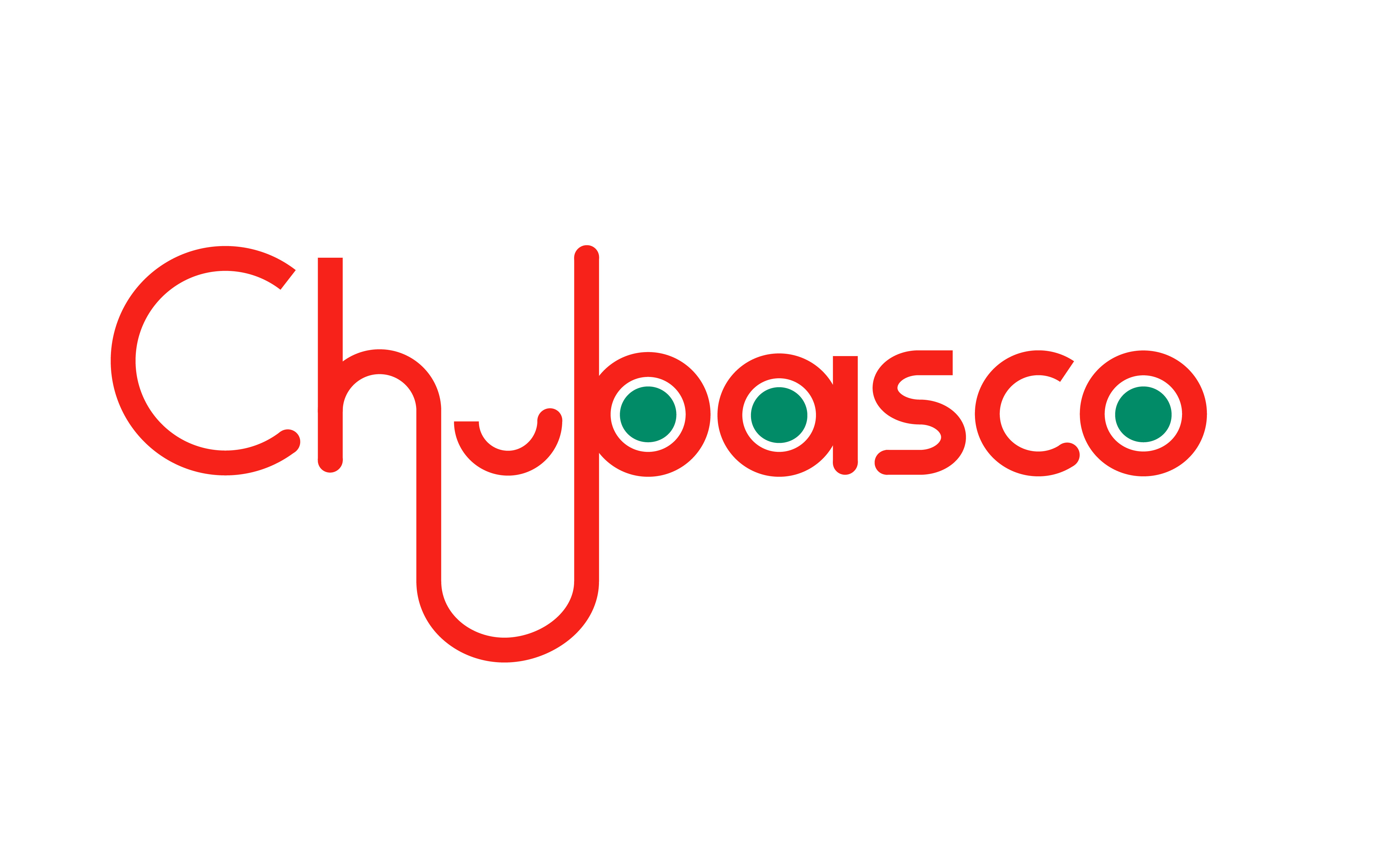
This project explores the process of mark making by merging a pair of distinctly different entities (in this case Tabasco and Chupa Chups) to redesign a new hybrid identity mark.
A x B = AB/ A > B/ A < B
Who?
(A) Tabasco is an American hot sauce company whos product portfolio comprises of 8 different hot sauces that are sold internationally.
(B) Chupa Chups is a popular Spanish lollipop and confectionary company.
A x B = AB/ A > B/ A < B
Who?
(A) Tabasco is an American hot sauce company whos product portfolio comprises of 8 different hot sauces that are sold internationally.
(B) Chupa Chups is a popular Spanish lollipop and confectionary company.
The redesign process began by considering differen products could be result from these two companies merging or a takeover.I then created an initial round of first sketches/ thoughts of marks that related to these ideas.
My visual research included dissenting competitors logos, and separating their visuals into -motifs, colour and type. Studying this in relation to the two companies historical evolution of their logos eventually led to the three outcomes.
The three possibilities of this merger could be:
AB
A > B
A < B
© Naomi Shah 2021